Announcement
Collapse
No announcement yet.
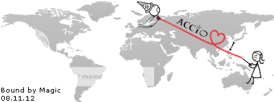
Created LDR image -- feedback please :)
Collapse
X
-
Created LDR image -- feedback please :)
February 2012 -- met online
August 2012 -- he said "I love you."
April 2013 -- met in person
June 2013 -- broke up
July 2013 -- back together
August 2013 -- 2nd visit
October 20, 2013 -- He proposed!
April 22, 2014 -- Married/closed the distance! Tags: None
-
-
Thanks! The dark outline is their lips reaching to kiss. It wasn't obvious? Maybe I've worked on it for so long that it looks obvious to me. Did you click on the pic to see the bigger version?
February 2012 -- met online
August 2012 -- he said "I love you."
April 2013 -- met in person
June 2013 -- broke up
July 2013 -- back together
August 2013 -- 2nd visit
October 20, 2013 -- He proposed!
April 22, 2014 -- Married/closed the distance!
Comment
-
WICKED! I defiantly looks better when the photo is a bit bigger.Made it official: 12-01-10
First visit: 3-29-13/4-09-13
Closed the distance: 07-31-13
Comment
-
Hmm... I wonder if I should show more of the faces and less of the maps -- maybe that would show it better. ???February 2012 -- met online
August 2012 -- he said "I love you."
April 2013 -- met in person
June 2013 -- broke up
July 2013 -- back together
August 2013 -- 2nd visit
October 20, 2013 -- He proposed!
April 22, 2014 -- Married/closed the distance!
Comment
-
Thanks Black_Halloween! Bluejay Belle, that makes sense! I'll add that to my list, redapple! I wanted to place where they live close to their lips but I'll dabble with it and see what else works.
  Last edited by Benni; May 5, 2013, 08:19 PM.February 2012 -- met online
August 2012 -- he said "I love you."
April 2013 -- met in person
June 2013 -- broke up
July 2013 -- back together
August 2013 -- 2nd visit
October 20, 2013 -- He proposed!
April 22, 2014 -- Married/closed the distance!
Comment
-
I could tell what the silhouettes were immediately! I love the idea but the maps throw me off. Perhaps if they were similar in proportions it would look more smooth.�The ties that binds us are sometimes impossible to explain. They connect us even after it seems like the ties should be broken. Some bonds defy distance and time and logic; Because some ties are simply� meant to be.� - Grey�s Anatomy

>Little Box<

Comment
-
I could tell it was a kiss straight away, only because I was expecting it. Agree with what the others have said. The black outline seems a bit thick and harsh, maybe try and make it thinner and try to make the silhouette larger so you can see more of the faces. And as Catface said, the thing that sticks out for me is the maps. You have two very different looking maps - ones closer up with smaller writing, ones zoomed out with the thicker writing and the square which is very distracting, and eats into the thick black outline of the faces you already have. I also think the text at the bottom could be made more prominent

"My arms will be your prison" - My Boyfriend [♥] Our LDR Blog!

Started Talking - October 2012
Started Dating - 08.11.12
First Meeting - 08.12.13 - 39 days together
Second Meeting - 16.12.15 - 31 days together

Rosetta Stone Progress
▄▄▄▄▄▄▄▄▄▄▄▄▄▄▄▄▄▄▄▄22 / 60

Comment
-
i Agre with what everyone else has said about it being two different kind of maps! However i personally LOVE IT!! i think its absolutely brilliant and i would love it if you could so such a thing for me!.
You could maybe make ones for other users that wanted it? and personalise it to their taste! i would love to see more!
well done!
Comment
-

I like it!
As others have said, I think that toning down the thickness of the outlines of the silhouettes will help. I'm also not a fan of the small US map in the top left corner. Would you be able to put in something more zoomed in like a map of Texas or the surrounding area of where you live?
Comment
-
Really cool! (:"I love the stars and the moon because I know that I'm always sitting under the exact same ones as you"
Comment


Comment